The first release in Destiny 2's Fate Saga, The Edge of Fate brought players to a planetoid called Kepler to investigate mysterious time-bending anomalies. The release also came with major changes to the business model, day-to-day gameplay structure, and reward systems in Destiny 2.
For this release, Neon built the point of entry for the campaign's Kepler destination (and, once again, implemented and calibrated the destination's map), while also serving as the lead for a group of three internal and co-dev Technical UX Designers in building out the release's flagship Activity Customization system with a focus on providing mentorship and growth opportunities to their colleagues.
Kepler Map
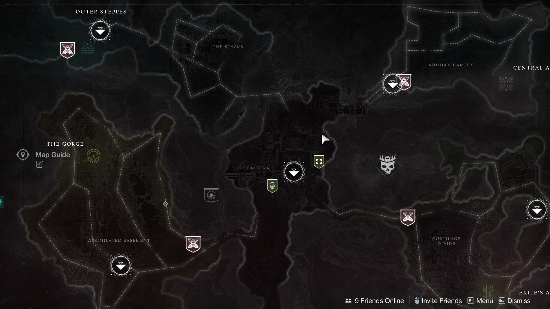
Thankfully, after the challenges of implementing the map for The Pale Heart of the Traveler in Destiny 2's The Final Shape expansion, Kepler's hub-and-spoke design made for—from a UI implementation standpoint—a straightforward map to implement and calibrate; once Neon's implementation was done, other Technical UI/UX Designers built and implemented the rest of the map's new features while Neon served as a consultant in order to stay focused on activity customization.
Credits
| Visual Design | Dustin Thaxton |
|---|---|
| Technical UI/UX Design | Neon O'Dea, Phil Etting, Marc Schroder |
Kepler
In addition to Kepler's map, Neon built out the point of entry for Kepler. For a combination of technical reasons and product priorities this was placed at the top level of the game's new Portal interface, a card-based interface for launching the activities that would best help players grow their Power.
Still, the intent was for it to eventually live on the Director interface (and, with the game's Monument of Triumph expansion, this came to pass) so it was built with the Director's affordances and constraints in mind: ensuring its assets fit within a memory budget and its use of shaders and masking techniques fit within a performance profile.
Breakdown
Most planet-shaped destinations in Destiny 2 share roughly the same implementation process, as outlined here. Every ten seconds, the video will move along one step in the process; the timecodes and descriptions below explain what is going on in each of those steps.
| Timecode 00:00–00:10 | The base surface texture of the planet, with some light UV animation |
|---|---|
| Timecode 00:10–00:20 | Adding the sphere shader, which performs a fast approximation of wrapping the surface texture around a sphere |
| Timecode 00:20–00:30 | Rotating the planet around multiple axes to get the angle and tilt that we want |
| Timecode 00:30–00:40 | Adjusting the color and intensity of the light being cast on the planetoid |
| Timecode 00:40–00:50 | Adding anomalous lines around the planetoid to tie in with the destination's narrative (this step might be dramatically different depending on the destination) |
| Timecode 00:50–01:00 | Overlaying additional lighting, atmospheric, and anomalous effects to bring it all together. These are all simple bitmaps with light animation, to stay in budget |
Anomalous Lines
On the ground, the “anomalous lines” that most visibly represent the anomaly on Kepler are present in great number. For clarity and readability at this scale, and to balance the overall piece, Visual Designers reduced their count.
While Neon's initial approach leaned more heavily towards trying to represent the lines as they appear on the ground, this proved tricky and looked busy. So, they simplified: while this effect may look complicated at first, it's actually a relatively straightforward UV animation with some clever masking.
| Timecode 00:00–00:10 | The lines and atmosphere used as a mask for the effect. This was pulled from the visual design pitch, with adjustments to the tinting, levels, and alpha to support its use as a mask |
|---|---|
| Timecode 00:10–00:20 | The underlying UV animation of a smokey texture animating inward, mirrored in both directions. The animation is then translated and rotated to better align the animation to the most visible lines sitting outside the mass of the planet |
| Timecode 00:20–00:30 | The final, masked visual effect |
Credits
| Visual Design | Dustin Thaxton |
|---|---|
| Technical UI/UX Design | Neon O'Dea |
Activity Customization
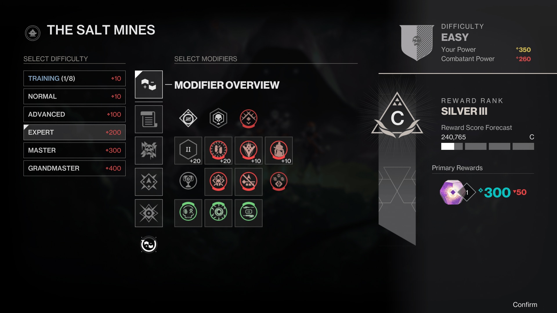
With The Edge of Fate, Destiny 2 took a big swing to invest in the repeatable activities that made up much of the daily and weekly gameplay: new, tiered armor and weapon systems tied to a reimagined Power climb and a risk/reward scoring system for both PvE and PvP activities.
To support this risk/reward structure teams began working on radical shifts to how difficulty worked in PvE activities, moving from heavily curated difficulties with fixed “modifiers” (gameplay-changing adjustments) that rotated weekly with frictioned reward structures to a player-driven customization system. The system was built on learnings from the game's earlier experiments with the “Nightfall card” system, giving players the ability to configure a wide range of activities—through a combination of difficulty settings and selectable modifiers—to hit score targets and grow their Power on their own timeline.
Neon served as the lead Technical UX Designer for the Activity Customization aspect of these changes; they planned and negotiated the new and changed data structures to support the system, prototyped and architected the selection and reward display interfaces, and worked directly with their team lead and other stakeholders to effectively delegate the work that needed to be done between three Technical UX Designers to ship the system successfully.
The above screenshot comes from Bungie's presskit and does not accurately represent what was shipped. Specifically: there is a “▼50” next to the reward Power level that did not ship due to technical constraints.
Difficulty
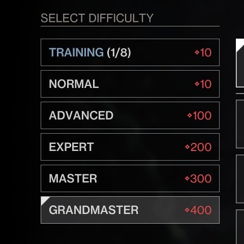
Previously, labels like “Expert” would convey fixed information about the toughness of enemy combatants and—roughly—the complexity of the modifiers applied to the activity. That toughness was enforced by “caps” on the difference between the Power level of the player and the Power level of their foes.
Under the new system these caps were no longer present and players could overlevel the enemy combatants in the activity, resulting in significant reductions to their rewards.
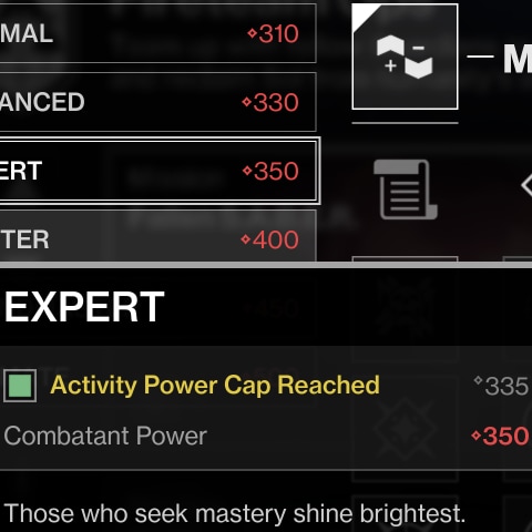
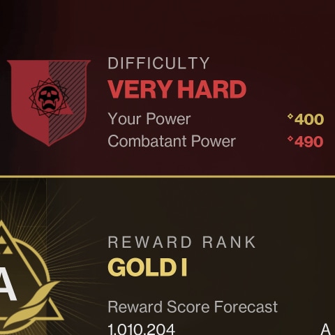
To help players understand this change, Neon adjusted the buttons used to select activity difficulties: instead of communicating the capped Power level for the activity, they now communicated the Power level of enemy combatants. Another Technical UX Designer reinforced this by adding a new “Combatant Power” section to the tooltip displayed when players inspected the selectable difficulty.
The second screenshot is from the current iteration of the game. Systemic changes to the scoring model in the game's next seasonal update removed the ability to overlevel combatants and re-implemented capped power in activities.
Being able to see the Combatant Power remained desirable to systems designers, so it was retained after Activity Power Caps were brought back.
Modifiers
Over the years, modifiers became a primary tool for adding non-statistical difficulty or complexity to Destiny 2's repeatable activities. Modifiers ranged from simple damage type buffs to the addition of new enemy types and behaviors that required buildcrafting to defeat.
As part of this new system, some modifiers would additionally add or remove Power from enemy combatants in the activity; more powerful combatants meant higher scores. To maximize rewards, players had to keep the Power level of enemy combatants above their own.
Neon's work augmented existing modifier communication by adding two new signals: a solid box around selectable modifiers, and a Power value at the bottom of modifiers with Power adjustments.
Systemic changes to the scoring model in the game's next seasonal release shifted back toward fixed Power differences in activities. This effectively removed the Power adjustment value.
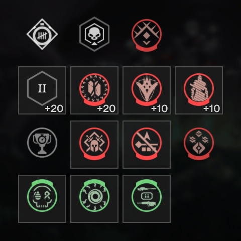
Modifier Selection
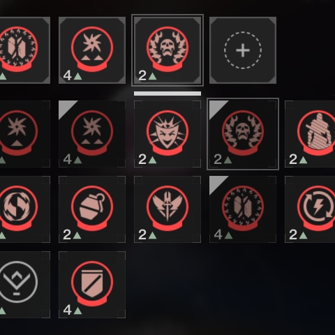
For the modifier selection interface itself, teams explored ideas ranging from roguelike-inspired option lists to curated groupings. To balance the costs of curation, technical realities, and existing player experience, they landed on a pattern informed by Destiny 2's existing systems for armor and weapon modification.
The resulting interface consisted of high-level categories with up to six individual slots (depicted at the top). Moving the cursor over a slot would expand a flyout containing the selectable modifiers that could be used in that slot; modifiers that could not be used together (eg. a weaker or stronger version of a modifier that has already been selected) or were already selected in another slot would be greyed out.
Due to the radically different data structures and systems at play—and the need to further optimize component usage—Neon rebuilt these patterns from the ground up.
These examples are from the current iteration of the game. When Destiny 2's next seasonal release removed Power adjustments from modifiers, score indicators were introduced; during the initial release of The Edge of Fate, 4▲ modifiers would have had a +20 in their bottom right corner and 2▲ modifiers would have had a +10 in their bottom right corner.
Combatant Difficulty
Previously, difficulty names had conveyed a general sense of enemy combatant damage & health pools. Specific information about the enforced difference between players' Power levels and the Power levels of enemy combatants in activities was communicated via modifiers that were present on the activity, which players frequently missed.
Now that players could configure the Power level of enemy combatants based on a combination of their taste and their desire for rewards, however, a more flexible and system was required. Neon collaborated with Sandbox, UX, and Visual Designers to implement a new system with distinctive shields (repurposing and expanding on existing Destiny visuals) and succinct labels. This information hierarchy gave players a noticeable and quickly-scannable rough signal for difficulty, and placed specific information alongside it that had previously felt buried.
During activity gameplay, the HUD displayed different icons above enemies based on their toughness: Neon adapted this system to share the calculations between the HUD and the pre-launch UI, reinforcing players' understanding of combatant difficulty through parity.
When Destiny 2 shifted back to capping Power in activities, this section was updated to swap “Your Power” with “Activity Power Cap” when the player is at or above the activity's Power cap.
Rewards Forecasting
Activities in Destiny 2 had limited capabilities for displaying rewards: some interfaces showed them, but the data source could not calculate their Power level and thus the UI did not show it. New and returning players in Destiny 2 frequently wondered, “How do I know what activities will grant me rewards that increase my Power level?”
With The Edge of Fate's plan for a more ambitious Power climb than past expansions, a related problem was created: players needed to understand when their configurations were sufficient to grant them rewards that advanced their Power. Teams correctly identified this early on as a critical problem for the UI to solve.
Neon worked with UI Engineers, Activity Engineers, and the Technical Designers for the scoring system to ensure that the exact calculations used during—and at the end of—activities to calculate score (and the score thresholds for different reward packages) were shared with the pre-launch UI. This allowed the UI to predict (assuming players completed all scoring objectives) player scores.
With both the score thresholds for reward packages and the predicted score in hand, Neon worked with Technical Designers to define the structures that would enable displaying those rewards based on the predicted score. The new data source enabled them to show the Power level of rewards and provided new affordances: players could now directly inspect the engrams—bundles of possible reward items—and see the potential rewards themselves without having to look for that information outside of the game.
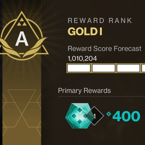
Predictive Forecasting
Showing players a predicted score for their current configuration was not enough, though: when selecting modifiers, players needed to understand the impact a potential modifier would have on their score. Without this, the UI team hypothesized that configuring an activity would be a chore riddled with trial and error. Playtests confirmed these suspicions.
This had been identified as a high-impact feature earlier on, but priorities slipped over the course of development and resources were allocated elsewhere; it risked being pushed to a later release. Near the end of the development cycle Neon collaborated with UI Engineers, building alignment between their team and area leads to fast-track its implementation, completing it just ahead of their lock date.
Results
For a variety of reasons, players… did not like this new system of scoring and rewards. They quickly resorted to optimizing their playtime, often re-running the same activity ad nauseum, in order to maximize their Power gains to reach the end of the Power climb and access the best rewards the game had to offer.
Designers moved quickly. They shipped changes to the scoring model and rewards in the game's next seasonal release, its Renegades release, and its final Monument of Triumph release. Many, but not all, of those changes did not require any new UI; designers already had the necessary tools and surface areas to achieve their goals.
Fortunately, players understood how to configure their activities and liked being able to see their rewards directly. Further changes to the scoring model leaned into what the UI was already good at doing, enabling the UI to more holistically serve its role. When changes did need to be made for the game's next seasonal release, Neon took ownership over those changes to protect the focus other Technical UX Designers had on the game's upcoming Renegades release.
Credits
| UX Design | Mai Tsuji, Anna Parmentier, Graeme Goodman |
|---|---|
| Visual Design | McKenna Morison, Dakota Galayde, Audrey Twigg |
| UI Engineering | Basil Elhindi |
| Technical UI/UX Design | Neon O'Dea, Tyler Zwiers, Zoe Soroka |